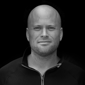
In our previous blogs we have been discussing the importance of great graphic design for business growth. In this blog we have the pleasure of featuring an interview with Shropshire based graphics designer, Matthew Mills, of Mills Graphics Design:-
Q1. What originally made you want to become a graphics designer?
If you ask my mother, she would say I have always liked colouring in and that if asked what I do today, she would say I colour in for a profession. For myself, the main inspiration for becoming a designer was based on the McLaren 1998 formula one car. The design was clean, simple and stylish and still looks good today.
Q2.What makes great design?
Unfortunately, the answer to the riddle of ‘what makes a design great’ isn’t a simple or straightforward formula that you can apply to every design. But I do believe in simple messaging and clean, clear design that stands out. With regard to logos, they should be simple and clear memory hooks. Nothing more, nothing less.
Q3. How do you describe your approach to design and what do you strive for in your design?
My first approach with all design briefs is research. Find out about the sector, what is good design, what is poor design, who are the market leaders, etc. Understanding the client too, as they (hopefully) understand their sector better than me. Question everything, as sometimes it good to offer a different opinion and make the client question their product or service. All good design requires a firm foundation from which you can build upon.
Q4 Who or what has had the biggest effect on your way of thinking?
A creative brief we had at University from JKR London. (Jones Knowles and Richie) The brief required us to question a brand and make it stand out more. This is something that had an influence on how I have approached briefs since.
Q5. What brands do you most admire and how do they influence your work?
Back in 1997, I picked up a brochure from BMW. It was when they started to introduce the sharper look to their cars. I liked at the time the simplicity of the design, they had used shading and embossing to get the effect. It made a lasting impression. And that what I look for in brands. A lasting impression.
Looking for fresh and compelling content? Or perhaps looking to re-brand? Rocket can work with you to improve your user retention, driving engagement and helping achieve your marketing goals.
For more information about us, please click here.


Q6. Are there any fonts that you are in love with right now?
I don’t think there are fonts that can be applied to all designs, it does depend on the sector and client. I have personal favourites, but these tend to be fonts that I believe worked 10 years ago and still stand out today.
Q7. One of the biggest graphic design trends to develop over the last news years has been responsive design. Can you give us some example of working with a client to produce a new responsive logo?
It an interesting concept, but one that hasn’t been a trend, as it’s a general rule of logo design. A logo needs to work on large scale and small scale. As a full logo and a simple icon.
As a rule now, all design should be considered as responsive design and the key to this is consistency. Consistency of how the logo is used and broken down for small usage.
A good place to see how responsive design work: www.responsivelogos.co.uk
To see Matthew’s work, please visit his website here: www.matthewmills.co.uk


Leave A Comment